9 Quick Updates that have a Big Impact on your Website

Getting started with Squarespace? Sign up for a free trial here and use the code PARTNER10 for 10% off your first year (Yep, that's an affiliate link!)
We all want to have a beautiful, well-designed website that reflects our brand perfectly. After all, your website is your online storefront and it is often the first impression someone will have of your business.
Your website shouldn’t just be beautiful though. You want it to work as your very own 24/7 sales person, so that it becomes a powerful asset for your business. It should perform well and get your visitors to take the action you want them to, whether that is to sign up for your email list, book a call with you or make a purchase.
If your website is old and outdated, screams DIY, or isn’t having any action happening, making some of these quick updates can help you come across as more legit and trustworthy and encourage your website visitors to hang around and take action.
Quick Updates for your Website
Calls to Action
Having a beautiful website is great, but it’s kind of pointless if our website visitors aren’t taking action. Most people won’t automatically know what they need to do on your website though, so we need to make sure we are telling them. This is where calls to action (CTA’s) come in.
We should have CTA’s weaved throughout our website to give our visitors a clear path to follow through our website and encourage them to take the actions we want them to take. Every page on our website should have at least one – we don’t want to leave any dead ends where a website visitor has nowhere to go, otherwise they will leave without doing anything.
Because CTA’s can direct our website visitors through our website, we can influence their journey if we think about what the main goal of our website is and what our visitors need to see before they will take action. Once we know what this is, we can guide our visitors there.
For example: If you’re a photographer, before someone books your service, they will want to check out your portfolio. If they like what they see, they will likely want to know prices to make sure you are within their budget. If they can afford you, they will then consider reaching out to you to book. Knowing your end goal is to get a booking, you would direct your visitors to your portfolio, then to your pricing information, and then to your booking form.
Your CTA’s should stand out so they are more likely to be clicked. Using buttons and colored links can really help with this! Remember, what we think is obvious as the next action to take may not be as clear to our website visitors since they don’t know their website as well as we do, so we really need to spell it out for them!
Navigation
Navigation is one area of your website you want to keep super simple and easy. It’s not somewhere to get creative with names or include a heap of options. The reason? Too many options or unclear options will leave your website visitors guessing where to go next, and confusion prevents us taking action.
It is best to stick with less than 5 options in your navigation where ever possible, so only include your most important pages (this also means avoiding dropdown menus as well). Any other pages on your website can be linked from other areas of your website, such as your website footer.
Sticking with clear navigation titles also helps your website visitors find what they are after easily. Think “Blog” versus “Musings”, or “Contact” versus “Coffee Chat”. This will help keep website visitors sticking around long enough to find what they are after.
Testimonials
Testimonials build credibility on a website since people are more likely to trust a review someone has left rather than just taking you at face value.
There is a right and a wrong way to handle testimonials though. The right way includes a photo of the person, lists their full name and business name, and will link to the person online (their website or a social media platform usually). This helps build trust like you wouldn’t believe, since there is no denying the testimonial is legit!
The wrong way? Faking testimonials. Don’t ever do it! It is misleading and will kill trust for your viewers quicker than anything else!
White Space
Have you ever noticed a website that is packed full to the brim with a million things looks really outdated? An easy way you can prevent this happening on your website it to make use of white space. It looks clean, simple and modern, but also makes it a lot easier for your website visitors to take in information by helping the eye focus on the most important content. White space doesn’t even have to be “white”, just negative space where the eye can rest.
To help create white space, you should remove any additional clutter such as unnecessary information, social links that you don’t currently use and images that no longer serve a purpose. This will keep an emphasis on the important information so that it can stand out more. Studies show this can actually increase your website visitors attention by 20%, which is great for making sure the important information is read!
Optimize for Mobile
People love their smartphones these days, there’s no denying it! Around 50% of all website traffic comes from mobile devices and 72% of smartphone users want mobile friendly websites, will come back to a website that is mobile friendly, or will leave one that isn’t.
Google also likes websites that are optimized for mobile, and will actually boost a mobile optimized website in search results compared to a website that does not work well on mobile. Therefore it pays to take the time to optimize your website for mobile visitors!
Squarespace already offers responsive templates that resize well for different devices, but it’s not always perfect. To see how your website looks on mobile devices, while you are editing your website, you can click the little line at the top of the screen and click the mobile option so you can make sure everything looks the way you want it on the smaller screen size.
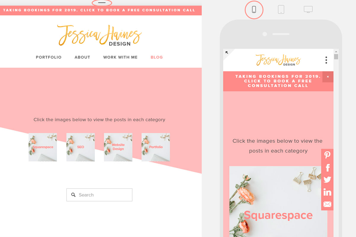
You also want to make sure that you go into your Site Styles to update the mobile styles so that all your font and color choices are on brand and consistent on your mobile website as well. While you are in there, you can also set up your mobile navigation so there is plenty of space to click the different navigation options and it looks just the way you want it to!
Great Images
The images you use on your website are super important! Photos are a great way to add personality to your website and build trust with your website visitors. Crappy photos will be a quick way to put someone off your website though. This post will help you choose the perfect images to use on your website so you can really make your website stand out.
Adding video is also another great option to help your website stand out. Video is a great way to show off your personality and more details about your business, and helps build up know, like and trust for your website visitors. An added bonus is that using video on your website can help you to build SEO over time.
Fonts
If we use 5 different fonts throughout our website, or choose our colors based on ones that look close to what we are after rather than using a specific color code, our website will start to look messy and overwhelming to our website visitors.
Instead, we want to stick with 2 font choices throughout our website, or occasionally a 3rd fancier option that can be used sparingly. When choosing the fonts you use, aim for modern fonts that pair together well. If you aren’t sure which font options will look good together, you can head over to Pinterest and search Squarespace font combinations for plenty of ideas!
With the colors you use for your website, you want to stick with a dark neutral color for your body text (think black, navy or dark grey), and you can use other colors for your headings and website links. You want to stay on brand with your color choices and limit the options to only 1-2 colors for your text. Also, using specific color codes for the colors you use will make sure everything is consistent and flows well on all pages of your website.
Make Text Easy to Skim
These days, most of us have short attention spans and a mile long to do list, so we tend to skim read websites. If we want someone to see something important on our website, we need to make it super easy for them to find it.
Large blocks of text are hard to take in on a computer screen, but there are ways we can format our text to make it super easy to read and digest. This will mean our website visitor is more likely to listen to what we have to say. Some things you can try:
Make use of headings throughout the page. Start with heading 1 at the top of the page, then use heading 2 as subheadings throughout the page. You can even add in some heading 3’s if you want to get really fancy! Not only does this make things easy to read, but it also helps with SEO since Google uses heading to assess what a page is about
You can skip full sentences in favour of bullet points to help break up text so it’s easy to find what someone is looking for. You can even use images or icons for these bullet points to add extra visual interest if you wanted to
Avoid wall-to-wall text. You know what I mean... That text that goes the full width of a page and is super hard to read? Make the text block narrower with spacer blocks or by placing another element beside the text. We take in information best on a computer screen if there is only 50-70 characters in the row of text
Anywere you have more than 2 lines of text should be left aligned. Centered or right aligned text can be hard to read with the jagged edge if you have a bigger block of text
Aim for larger font sizes so you’re website visitors don’t have to strain to read what you have written. 14-18px is a great size for your body text, then larger sizes for each heading
Broken Links
Having broken links on your website is a quick way to frustrate your website visitors (and it’s not great for SEO either). If they see a link they really want to view, only to have it take them to an error page, it will kill the chance of them hanging around much longer.
At least once a year, you should run a scan on your website to check for any broken links so that you can fix them. Don’t worry, you don’t have to go through and check them all manually though. Instead, use a link checking website such as this one to check for the broken links. It only takes a few minutes to scan, and depending on how many you have, it generally won’t take too long to fix them.
While you are at it, you might want to set up a custom 404 error page on your website. This way, if someone does come across a broken link, they are more likely to hang around to find what they are after rather than jumping ship straight away.
Focusing on making some or all of these updates to your website can really help to make your website more user friendly and turn it into a conversion machine so that it works even harder for your business!
I’d love to hear what changes you want to make on your website after reading these tips. Let me know in the comments!
Don’t want to make these changes yourself? Let’s chat about how I can help you with a beautiful, hard working website!