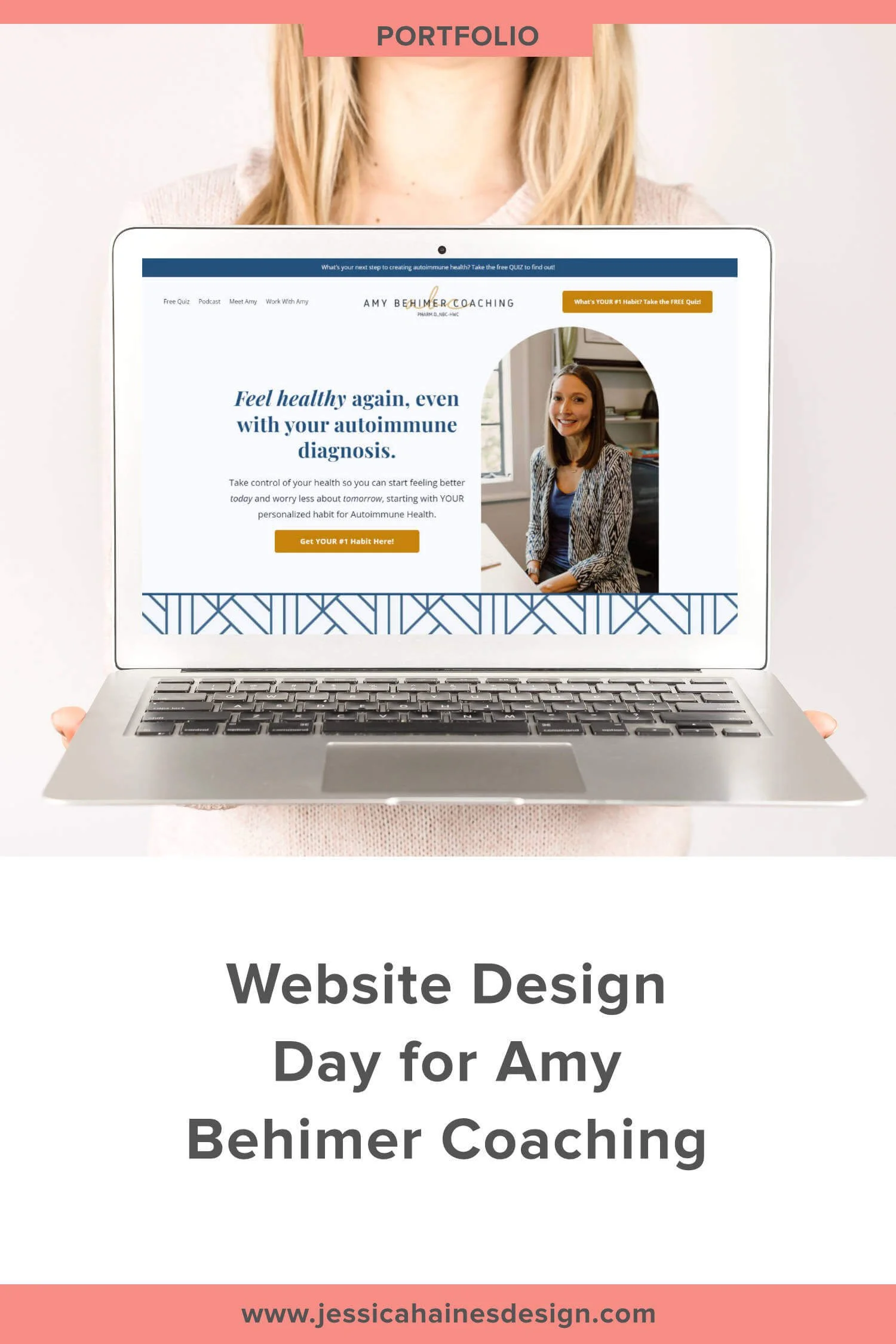
Website Design Day for Amy Behimer Coaching
Getting started with Squarespace? Sign up for a free trial here and use the code JHD10 for 10% off your first year (Yep, that's an affiliate link!)
Feeling a like your website design is a bit elementary after DIYing your website, and unsure how to clean things up on your own?
That’s how my client, Amy Behimer, was feeling before our Website Design Day. In her words, she was too close to the words and needed a designers eye to take things to the next level, and that’s where I came in to to help her out.
She was hestitant about working with a designer since she wasn’t sure she could clearly state what she needed or wanted design-wise, but after jumping on a call where we chatted about my process, the ways I help her get her ideas out of her head, and all the opportunities she has for feedback and changes, she was all in!
Now, she can happily say she has the building blocks to create better designs for her business when she needs to throw something together.
Here’s what Amy said her favourite part of working together was:

“Jessica. Hands down. She is professional, kind, generous, smart, patient, and confident. I truly enjoyed working with her. She gave me options and went above and beyond to see our vision through from the strategy session.
Jessica will look out for you to ensure you get what you need (especially the things you don't even know you need)!”
Seriously, I have the best clients, and Amy absolutely made my day when she sent this through! 🥰

Amy’s Website Goals:
When Amy came to me, she was getting ready to launch her group coaching program, The CLUB Habit Hub, and really wanted to her website to help her attract and connect with those dream clients that get her and that she could really help on their autoimmune journey.
Amy wanted her dream clients to feel like they were seen, heard and understood when they landed on their website, so they would feel confident that she could support them on their journey to take control of their health.
Our goal for our Website Design Day was to refresh Amy’s home page, about page and CLUB Habit Hub pages so they had a better flow, highlighted her testimonials, helped boost her SEO a bit and directed potential clients to book a Roadmap Session with her so she could talk to them about their health challenges and how she may be able to help them.
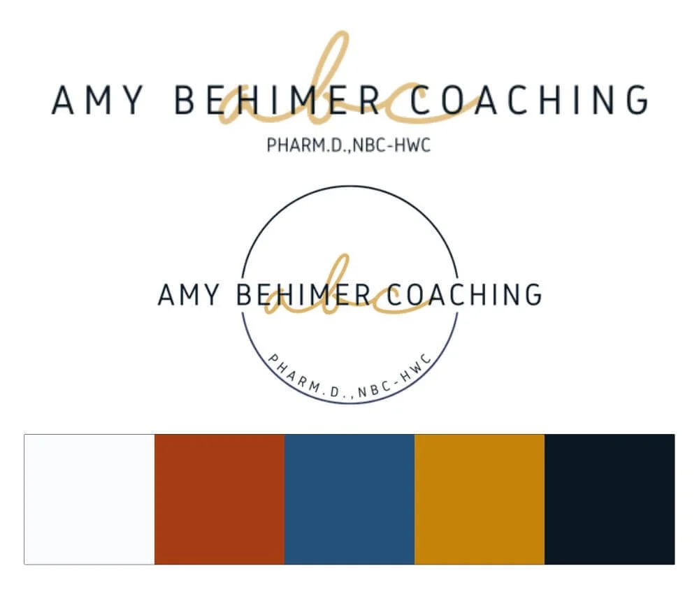
Here’s a peek at Amy’s branding before and after ⇩⇩
Branding Before

Branding After
Here’s what we managed to get done during our day together:
We refreshed Amy’s logo so there is more emphasis on what she does, rather than the “ABC” part of it (which stands for Amy Behimer Coaching, in case you’re wondering!). Amy was having trouble working with the circular format of her logo initially, so now she has a new horizontal and circular version that is easier for her to use
We dived into colour psychology to refresh her colour palette to resonate with her ideal clients. The colours flow well with her brand photos and add a grown up vibe that will help her dream clients feel safe and supported by working with her and added a cute geometric pattern into her branding
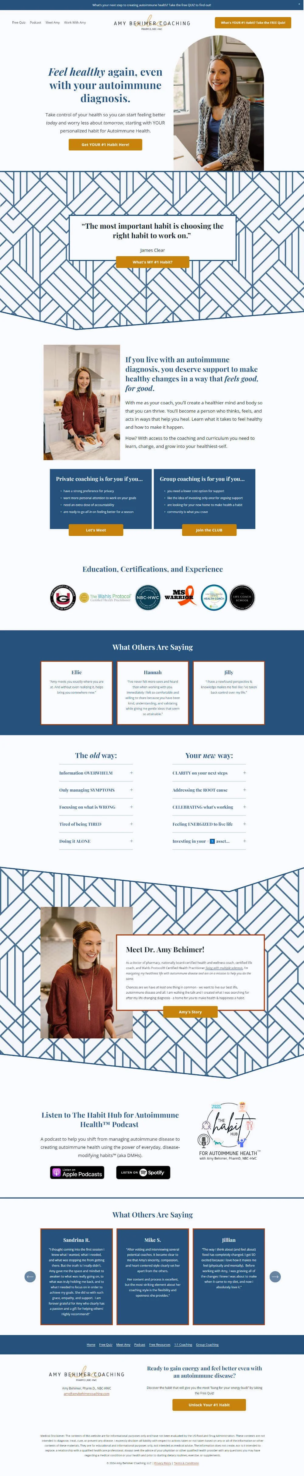
We redesigned Amy’s home page to focus on her getting visitors to her services and booking her Roadmap session calls while highlighting her expertise to help boost her credibility through testimonials, showcasing her education and certificates and drawing attention to her prodcast where she shares tips to help you modify your habits so you can create autoimmune health
We redesigned Amy’s about page to flow well with her home page and highlight her credibility through her education and testimonials. We also drew more attention to the next steps for her visitors to take to work with her by adding an photo of her for her visitors to connect with along with buttons to clearly direct visitors to the next steps
We redesigned the CLUB Habit Hub page to help draw her visitors down the page to learn about her coaching program. We’ve weaved in tesimonials to showcase the results she helps her clients get, plus photos of Amy to help create a connection with her readers. We also weaved through call to action buttons to encourage the people she can help to jump on a Roadmap call with her so she can get an understanding of their needs and how to best support them
We spent time strategising how Amy can use her podcast to help attract more visitors to her website and grow her SEO when she has more time to move the content over to her website, and I recorded some training videos so that Amy is able to update her site and maintain the look and feel going forward
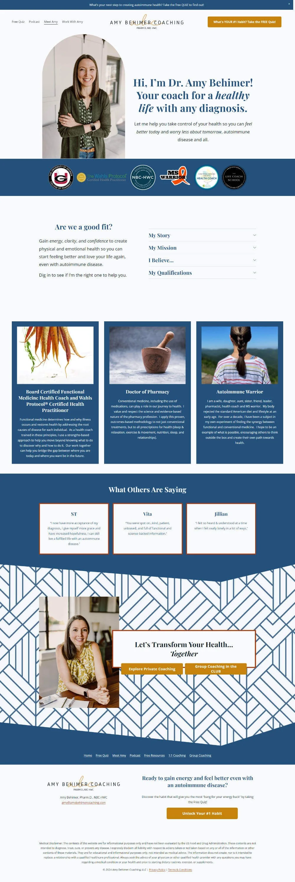
Here’s the home page before and after ⇩⇩
Home Page Before
Home Page After
Favourite Creative Features:
1 | The angled section divider at the bottom of some sections that helps draw your eyes down the page. This helps keep visitors exploring Amy’s website for longer, so they’re more likely to join her email list, check out her group program or podcast, or book a Roadmap session
2 | The boxes around the text on the patterned section makes the text easier to read while also drawing attention to the information inside. This means visitors will be more likely to see and read the details instead of scrolling on past, and also helps the calls to action on those sections to be anchored to the text better
3 | I made the buttons brighter using the yellow in Amy’s new colour palette, and they change to red when you hover over them. This is a great way to catch visitors attention when they’re scrolling the page, and the unexpected little detail adds some depth to the design
4 | I created a new footer on Amy’s website that includes a secondary navigation so that readers can easily keep exploring her website if they haven’t found what they’re after. I’ve also added a button to go to Amy’s free quiz which helps her visitors identify which health habit to focus on for best results for them, which also helps Amy grow her email list
5 | We’ve used accordians to hide away some of the larger sections of text to prevent having large walls of text that can be overwhelming or offputting for readers. People that are interested in reading the details can still easily click to see what’s there, and it adds a little more visual interest to the design as well
Here’s the about page before and after ⇩⇩
About Page Before

About Page After
Are you ready for a website that gets found in Google, grows your email list, books clients and shows off your authority so you stand out as the expert in your niche and raise your rates? I’d love to help you create some magic with your website!


